Notice that they have helpfully labeled the LED as "LED." What does the LED indicate? I have no idea. To find out, I would have to read the documentation. And I'll bet that it was not written or edited by a native English speaker. I'm okay with this, because I bought the $19 box instead of the $29 box, and I'd rather have the $10 than a well-labeled LED since I'm generally not looking at it anyway. Still, I find it kind of sad that it was important enough to cast the text under the LED into the metal of the housing, but not important enough to actually convey any information with it.
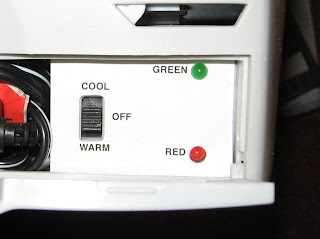
Likewise, this consumer widget helpfully indicates the specific color of the LEDs:

Now, you might glean some additional information from the adjacent position labels on the switch, inferring that green means it is cooling and red means it is warming. Although it could also be that green means it is working, and red means it is not. Or green means that it is at temperature, and red means it is in the process of changing temperature. I just don't know. In any case, perhaps this is the last market differentiator available at the low end. If I had a choice between the cheap item with a random, useless UI design, and one in which someone had put several hours of thought into how to make it slightly more usable, I'd probably buy the slightly more usable one. Although only if it doesn't cost any more...
No comments:
Post a Comment