Sunday, March 16, 2008

Subtly Deceptive Advertising

I have always found the effectiveness of advertising to be surprising. I like to think, "Oh no, surely I am far above being so obviously manipulated into buying stuff I don't really want or need." But I know, deep down, that I can be manipulated just like virtually all consumers. Junk-food ads, in particular, make me drool. I want that artery clogging burger even knowing that the real product looks nothing like the studio-beautified example shown in print or on TV. And a close-up of the bubbly spray off the top of an icy cold Coke brings back fond memories of happy times with friends, and makes me really want that Coke... and I don't even drink cola anymore!

But worse than that sort of direct manipulation in advertising is use of the false comparison. Often advertisers not only have to make you want their product, but they have to make you want it more than some competing alternative. Usually this involves explaining why the benefits of one outweigh the other. But there is also a way to "cheat": the false comparison. The latest example I've seen is this photo from a postcard advertising invisalign braces:

The apparent message in this photo is "invisalign looks better on your teeth than conventional braces." The unspoken, subtle and manipulative implication is "invisalign users have better, smoother skin with no wrinkles or visible pores, their lips are full and glossy pink, and their noses are tinier with smaller nostrils." This is, or course, absurd. But that's the message your brain picks up without you ever being aware of just how bogus the comparison is. All you register consciously is, "wow, the invisalign side really does look much better."

If you look for it, you might be surprised how often this trick is used in advertising, particular in "before and after" photos. But it usually only shows up in professionally produced mass advertising. Many small businesses and small web sites will run very reasonable photos of "this is what it looked like when we started" and "this is what it looked like when we finished." But the cost of mass mailings or print ads is so high that advertising firms have to do anything they can to improve the success rate for their client, to justify selling them more advertising.

This technique feels sleazy to me, and makes me dislike products that use it. And it's not even necessary. I think invisalign is a great product. But the use of this false comparison technique actually makes me think poorly of the company and, by extension, what they are selling. I suspect that's not the perception they were hoping to buy with their advertising dollars.

Sunday, March 2, 2008

Bad Hardware UI Design

I am cheap. I admit this by way of explanation for why I often buy the lowest cost functional equivalent for many of the things I use. In electronics, this means that I will purchase the no-name brand if it offers the same functionality as the branded version. Looking at Gigabit Ethernet PCI NICs recently, I realized that they were ALL using the exact same Realtek chip. Thus it made no difference which one I purchased, they were all basically the same component on a PCB implementing the chip maker's reference design, with price as the only differentiator. You could possibly argue that there are differences in quality of PCB fabrication or assembly, but they are all made in China, and there's a pretty good chance that multiple brands came off the same assembly lines, or at least lines at the same manufacturer. They have all been cost reduced to the bleeding edge of functionality, so to my thinking they are all basically the same.

The differences that do pop up between the name brand products and the no-name versions are in the little design details. It struck me twice this weekend when I ran across amusing examples of bad hardware user interface design. The first was this USB drive housing for ATA hard drives:


Notice that they have helpfully labeled the LED as "LED." What does the LED indicate? I have no idea. To find out, I would have to read the documentation. And I'll bet that it was not written or edited by a native English speaker. I'm okay with this, because I bought the $19 box instead of the $29 box, and I'd rather have the $10 than a well-labeled LED since I'm generally not looking at it anyway. Still, I find it kind of sad that it was important enough to cast the text under the LED into the metal of the housing, but not important enough to actually convey any information with it.

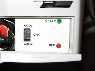
Likewise, this consumer widget helpfully indicates the specific color of the LEDs:


Now, you might glean some additional information from the adjacent position labels on the switch, inferring that green means it is cooling and red means it is warming. Although it could also be that green means it is working, and red means it is not. Or green means that it is at temperature, and red means it is in the process of changing temperature. I just don't know. In any case, perhaps this is the last market differentiator available at the low end. If I had a choice between the cheap item with a random, useless UI design, and one in which someone had put several hours of thought into how to make it slightly more usable, I'd probably buy the slightly more usable one. Although only if it doesn't cost any more...