On one hand, I know that the accelerating march of technology is a cliche. But I still find it interesting how some things that were novelties a few years ago, and still spreading last year, I just expect now. Three examples that leap to mind are TiVo (or more generally DVRs), cell phones, automotive smart keys.
I called my parents today to say "hi," but they were about to watch the Belmont Stakes, and so we quickly arranged to talk later. They don't take TV particularly seriously, having for years had about three and a half low-quality broadcast channels available to them. We just got their broadcast digital converter box working last weekend, so they now have about 10 nice looking digital standard def channels. And yet still I found myself surprised at the idea of needing to watch television according to the broadcast schedule. Of course they have a VHS VCR with which they could have recorded the race, if it was hooked up (it's not). But I realized that I now just assume everyone has a TiVo or other DVR with which to trivially pause or time shift their TV viewing. Almost everytime I turn on the TV in our living room now, it is paused at whatever the last person was watching. The notion of "live TV" quietly transitioned in my brain in the last few years from obvious to an amusing anachronism.
Likewise, cell phones have made the jump. When I swap contact information with people now, the question isn't "Do you have a cell phone," but rather, "Do you still have a land line?" I still remember telling someone to call me on my cell phone in 1994 and being met with an incredulous "Are you serious?" Now that same surprise would meet the news that someone *didn't* have a cell phone.
And finally, the Smart Key system in my Prius has managed to warp my perception of how cars should behave when I try to drive the minivan or my daughter's Subaru. I sometimes find myself walking up to the cars other than the Prius and standing holding the handle waiting for it to beep happily and unlock for me. Instead, it just sits there. Or sometimes I hop into the driver's seat and reach futily for the non-existent "Power" button to turn it on. The need to actually take the key out of my pocket just seems so retro now.
So what new functions, capabilities, and personal accessories will be so completely ubiquitous that we completely take them for granted in another 5, 10, or 20 years? And how can I start building them today?
Saturday, June 6, 2009
Wednesday, November 12, 2008
It's a Wonderful Calculation
November marks the official start of the "It's a Wonderful Life" season, in which my wife and I will use the DVD of this Frank Capra classic as background viewing more or less continuously until we ring in the new year two months from now. There are several major plot points in the movie that center around specific amounts of money. It's difficult to get a good grasp on the scale of these dollar amounts unless you adjust them for inflation. Fortunately, there are many good inflation calculators available online. Using the consumer price index (CPI) data from the last 200 years, they can calculate what a dollar amount from a prior year would be worth today.
For example, when Mr. Potter tries to hire George Bailey, George angrily says he's making $45/week, not $40. In the story time line, this happens in about 1933. $45 dollars in 1933 is equivalent to about $714/week in 2007 dollars (the last year for which this particular calculator has CPI data), or about $37,130. By comparison, Mr. Potter offers him a three year contract at $20,000/year. That is equivalent to about $317,160/year. That's a huge amount of money for a small-town businessman scrimping to get by, particularly when compared to what he makes at the building and loan. That's what makes it all the more amazing when he turns it down flat.
Later, Uncle Billy accidentally hands Mr. Potter the Bailey Building and Loan's $8000 bank deposit with the newspaper. That $8000 loss is what drives George to the brink of suicide. It doesn't sound like much, but in 1945 dollars, that was like misplacing over $91,200 now. Sadly, given recent economic news, it still doesn't sound like much. I wish any banking executive could get upset over a loss of $90K. You can almost hear the modern day dialog now: "Do you have any idea what this means? Bankruptcy and scandal and prison! Well, no, not really! But after the government bails us out, they might shave a few percent off my massive annual bonus! I may have to drive the same car for two years in a row! Intolerable!!" Sigh. I think I need to go watch "It's a Wonderful Life" now...
Thursday, September 18, 2008
Installing Windows XP...
My primary home file server PC recently died, so I build up a Shuttle SN68SG2 bare-bones PC to replace it. Then I got out the original installation discs for the Windows XP that had been on the deceased machine, and installed it on the new box. Just for grins, I kept track of how many times I had to reboot during the Windows XP installation. The sequence was as follows:
- Formatted the new hard drive, then copied the Windows files to it, then rebooted.
- Installed Windows, rebooted.
- Configured Windows, rebooted.
- Installed motherboard drivers, rebooted.
- Installed Windows Updater, rebooted.
- Installed Service Pack 2, rebooted.
- Installed Service Pack 3, rebooted.
- Installed the next 16 windows updates, including IE 7, rebooted.
- Installed PowerDVD software that came with DVD drive, rebooted.
- Updated Optical Drive Firmware, powered down, then rebooted.
- Installed Nero disc burning software that came with the DVD drive, rebooted.
- Installed McAfee Security Center, rebooted.
So 12 reboots to get the machine to a more or less usable point... Hmmm.
Sunday, March 16, 2008
Subtly Deceptive Advertising
I have always found the effectiveness of advertising to be surprising. I like to think, "Oh no, surely I am far above being so obviously manipulated into buying stuff I don't really want or need." But I know, deep down, that I can be manipulated just like virtually all consumers. Junk-food ads, in particular, make me drool. I want that artery clogging burger even knowing that the real product looks nothing like the studio-beautified example shown in print or on TV. And a close-up of the bubbly spray off the top of an icy cold Coke brings back fond memories of happy times with friends, and makes me really want that Coke... and I don't even drink cola anymore!
But worse than that sort of direct manipulation in advertising is use of the false comparison. Often advertisers not only have to make you want their product, but they have to make you want it more than some competing alternative. Usually this involves explaining why the benefits of one outweigh the other. But there is also a way to "cheat": the false comparison. The latest example I've seen is this photo from a postcard advertising invisalign braces:
 The apparent message in this photo is "invisalign looks better on your teeth than conventional braces." The unspoken, subtle and manipulative implication is "invisalign users have better, smoother skin with no wrinkles or visible pores, their lips are full and glossy pink, and their noses are tinier with smaller nostrils." This is, or course, absurd. But that's the message your brain picks up without you ever being aware of just how bogus the comparison is. All you register consciously is, "wow, the invisalign side really does look much better."
If you look for it, you might be surprised how often this trick is used in advertising, particular in "before and after" photos. But it usually only shows up in professionally produced mass advertising. Many small businesses and small web sites will run very reasonable photos of "this is what it looked like when we started" and "this is what it looked like when we finished." But the cost of mass mailings or print ads is so high that advertising firms have to do anything they can to improve the success rate for their client, to justify selling them more advertising.
This technique feels sleazy to me, and makes me dislike products that use it. And it's not even necessary. I think invisalign is a great product. But the use of this false comparison technique actually makes me think poorly of the company and, by extension, what they are selling. I suspect that's not the perception they were hoping to buy with their advertising dollars.
Sunday, March 2, 2008
Bad Hardware UI Design
I am cheap. I admit this by way of explanation for why I often buy the lowest cost functional equivalent for many of the things I use. In electronics, this means that I will purchase the no-name brand if it offers the same functionality as the branded version. Looking at Gigabit Ethernet PCI NICs recently, I realized that they were ALL using the exact same Realtek chip. Thus it made no difference which one I purchased, they were all basically the same component on a PCB implementing the chip maker's reference design, with price as the only differentiator. You could possibly argue that there are differences in quality of PCB fabrication or assembly, but they are all made in China, and there's a pretty good chance that multiple brands came off the same assembly lines, or at least lines at the same manufacturer. They have all been cost reduced to the bleeding edge of functionality, so to my thinking they are all basically the same.
The differences that do pop up between the name brand products and the no-name versions are in the little design details. It struck me twice this weekend when I ran across amusing examples of bad hardware user interface design. The first was this USB drive housing for ATA hard drives:

Notice that they have helpfully labeled the LED as "LED." What does the LED indicate? I have no idea. To find out, I would have to read the documentation. And I'll bet that it was not written or edited by a native English speaker. I'm okay with this, because I bought the $19 box instead of the $29 box, and I'd rather have the $10 than a well-labeled LED since I'm generally not looking at it anyway. Still, I find it kind of sad that it was important enough to cast the text under the LED into the metal of the housing, but not important enough to actually convey any information with it.
Likewise, this consumer widget helpfully indicates the specific color of the LEDs:
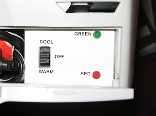
Now, you might glean some additional information from the adjacent position labels on the switch, inferring that green means it is cooling and red means it is warming. Although it could also be that green means it is working, and red means it is not. Or green means that it is at temperature, and red means it is in the process of changing temperature. I just don't know. In any case, perhaps this is the last market differentiator available at the low end. If I had a choice between the cheap item with a random, useless UI design, and one in which someone had put several hours of thought into how to make it slightly more usable, I'd probably buy the slightly more usable one. Although only if it doesn't cost any more...
Monday, December 31, 2007
Welcome to Weekend Engineering
I have considered, for years now, whether I had anything worthy of adding to the massive stream of effluent that makes up the blogosphere. And if I did establish a blog, what sort of voice would I try to maintain? Some pretentious psuedo-wit that uses words like blogosphere and effluent? And worse yet, would I turn into one of those "wink-wink, look how clever I am with my self-referential humor" gits? Would I even find myself displaying affectations like British-isms thrown in to further my pathetic self aggrandizement?
I just don't know.
But I do know that every now and then I run across or learn something that is worthy of recording SOMEWHERE on the Internet so that the next time someone else needs to know the same trick, there is a slightly higher chance Google will show them the way. And thus I'm establishing Weekend Engineering.
I may also use this to document my own projects, if I do anything in the open world. We'll see. In the meanwhile, here's a start. Now the next interesting question is whether there will ever be a post #2!
Subscribe to:
Posts (Atom)